Red Shoes – Mobile E-Commerce UI/UX Design
Project Overview
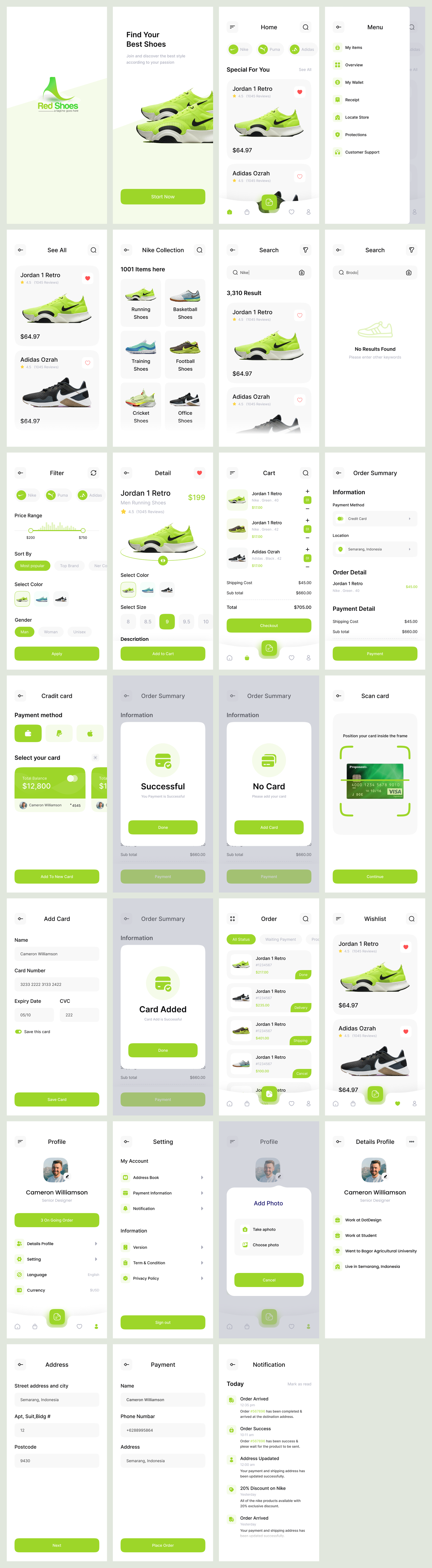
Red Shoes is a modern, clean, and fully functional mobile e-commerce UI concept tailored for a shoe retail experience. Designed for style-savvy users, the app focuses on delivering a seamless browsing, selection, and purchasing process for footwear enthusiasts. Every screen has been meticulously crafted to ensure user flow, functionality, and aesthetics work together harmoniously.
Key Features
🛍️ Immersive Shopping Experience
From the landing screen to the final checkout, users are guided through an engaging and intuitive interface. Product imagery is front and center, enhancing visual appeal and user interest.
🧭 User-Centric Navigation
Smooth transitions between categories, filters, product details, and cart ensure users never lose track of their shopping journey. A clean bottom nav bar and burger menu support quick access to essential functions.
🔎 Powerful Search & Filter Options
Users can search through thousands of items with smart filters for price range, gender, type, and popularity. The advanced filtering system streamlines the path to the perfect pair.
👟 Product Detail & Variant Selection
Detailed product views with rating, color options, size selection, and engaging 3D-style product visuals help users make confident purchase decisions.
💳 Robust Checkout & Payment Flow
Secure payment methods, order summaries, and confirmation screens ensure a trustworthy user experience. Card addition, scanning, and management flows are all clearly and cleanly designed.
❤️ Wishlist & Profile Management
Personalization options allow users to manage wishlists, view order history, edit profile info, and control notification settings effortlessly.
🧾 Order Tracking & Notifications
Real-time order status, delivery updates, and marketing promos are integrated into a clean notification center to keep users informed and engaged.
Design Highlights
Color Palette: A refreshing combination of soft gray and bright lime green gives the app a bold yet clean visual identity.
Typography: Rounded sans-serif fonts create a friendly, modern tone while ensuring readability.
Minimal UI Elements: The design relies on soft shadows, spacious layouts, and consistent iconography for clarity and polish.
Responsive Components: All screens are designed to scale smoothly across different mobile devices and resolutions.
Tools Used
Figma (for wireframing and UI design)
Adobe Illustrator (iconography and logo design)
Unsplash / Mockup sources (for product images and branding)

Read the author's instructions below to know how you can get help.
Contact email: N/A
Phone number: N/A
This item has no comments
Sign In to comment
Subscribe to access unlimited downloads of graphics and more premium assets for your creative needs.
Member since May 2025
Published:
May 30, 2025 02:36 AM
Category: